A touch of originality and warmth! Find out how to match colors at home.
Choosing and matching colors for your home is one of the most important aspects of creating a welcoming and personal environment.
The right color balance can influence not only the aesthetic appearance of spaces, but also the mood and emotions of those who live there. Well-matched colors can brighten a room, make it appear larger, or convey a sense of warmth and intimacy.
Conversely, the wrong combinations can create confusion and make the space unpleasant. But how do you find the perfect mix to enhance each room? It's essential to know a few basic rules and let your personal taste inspire you. Let's discover how to match colors in your home , the importance of a harmonious space, and three practical tips for getting the most out of your decor.
Why is it so important to match colors in your home?
Color is not just an aesthetic choice, but a powerful tool that influences the atmosphere and perception of spaces.
For example, light, neutral shades can make a room appear larger and brighter , while dark, bold colors add depth and character. Colors also convey emotions: blue evokes calm and relaxation, yellow stimulates energy and creativity, while green conveys balance and serenity. Carefully matching colors not only creates a visually pleasing environment, but also a place that reflects the personality of its occupants.
Each color has its role and function, and a balanced combination can transform even the simplest spaces into unique environments.
Interior Color Combinations at Home: 3 Practical Style Tips
To create an aesthetically pleasing environment, it's important to follow some guidelines to facilitate color selection. Here are three helpful tips for combining colors in your home with style and personality.
1. Follow the 60-30-10 rule
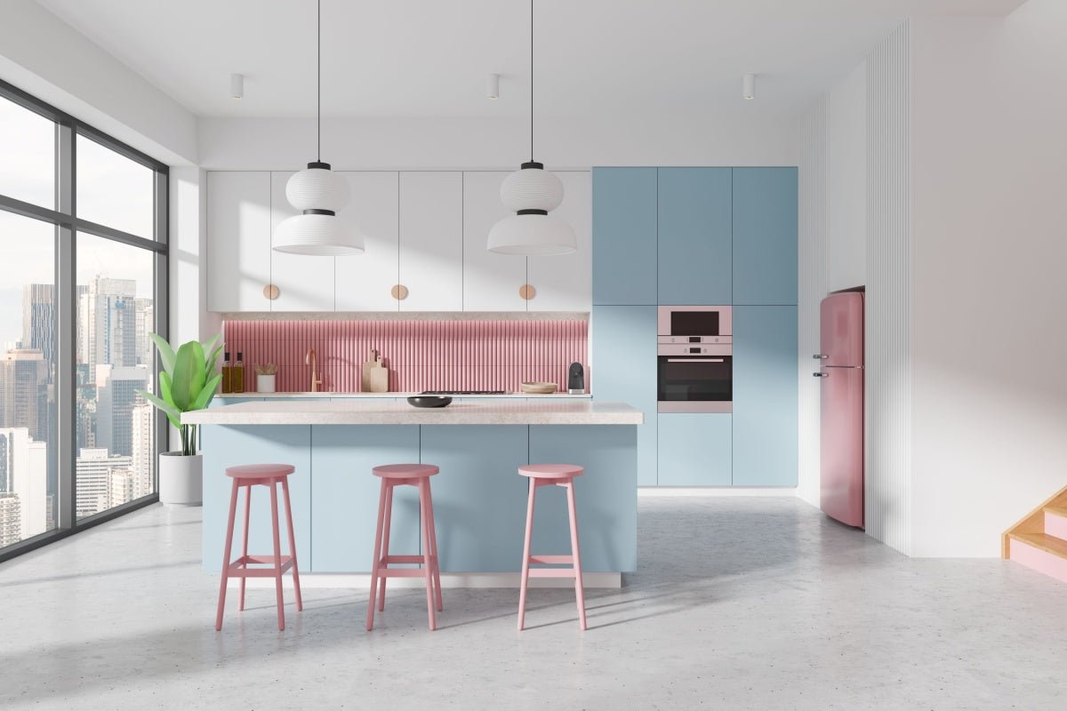
This rule is a classic in interior design and helps balance colors harmoniously . It consists of dividing colors into three categories: 60% of the room (usually walls) should be occupied by the main color, 30% (furniture and fabrics) by the secondary color, and 10% (accessories and details) by an accent color. This scheme ensures balance and visual order , allowing you to experiment with different shades without overdoing it.
2. Choose a consistent palette
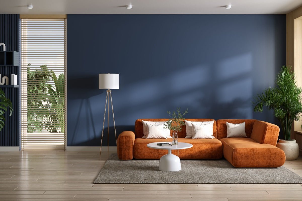
To avoid chaotic combinations, it's helpful to choose a well-defined color palette . You can take inspiration from a color wheel and opt for complementary colors (opposite each other) or analogous colors (near each other). For example, blue and orange create a lively yet balanced contrast, while beige and brown create a natural, soothing effect.
3. Play with contrasts and textures
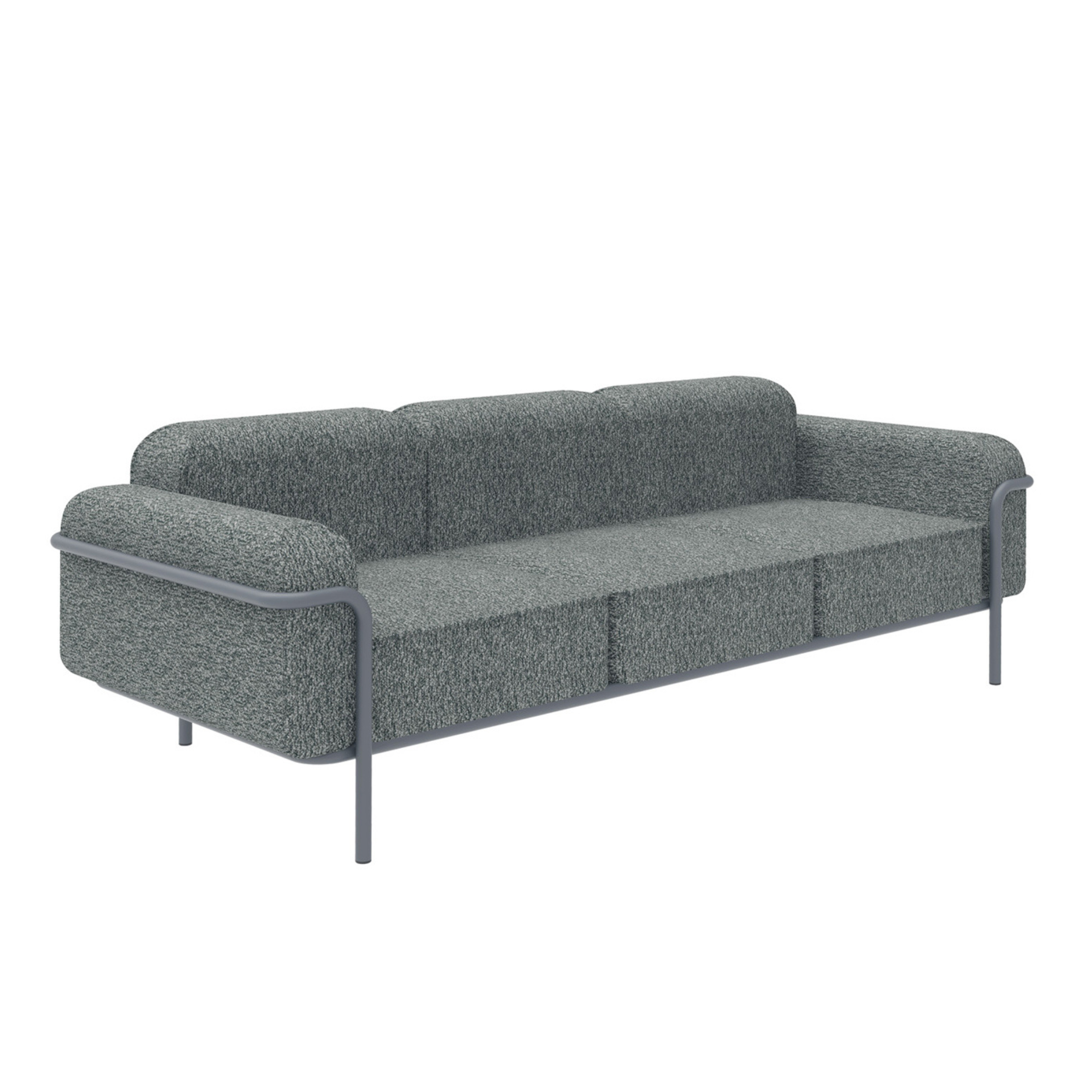
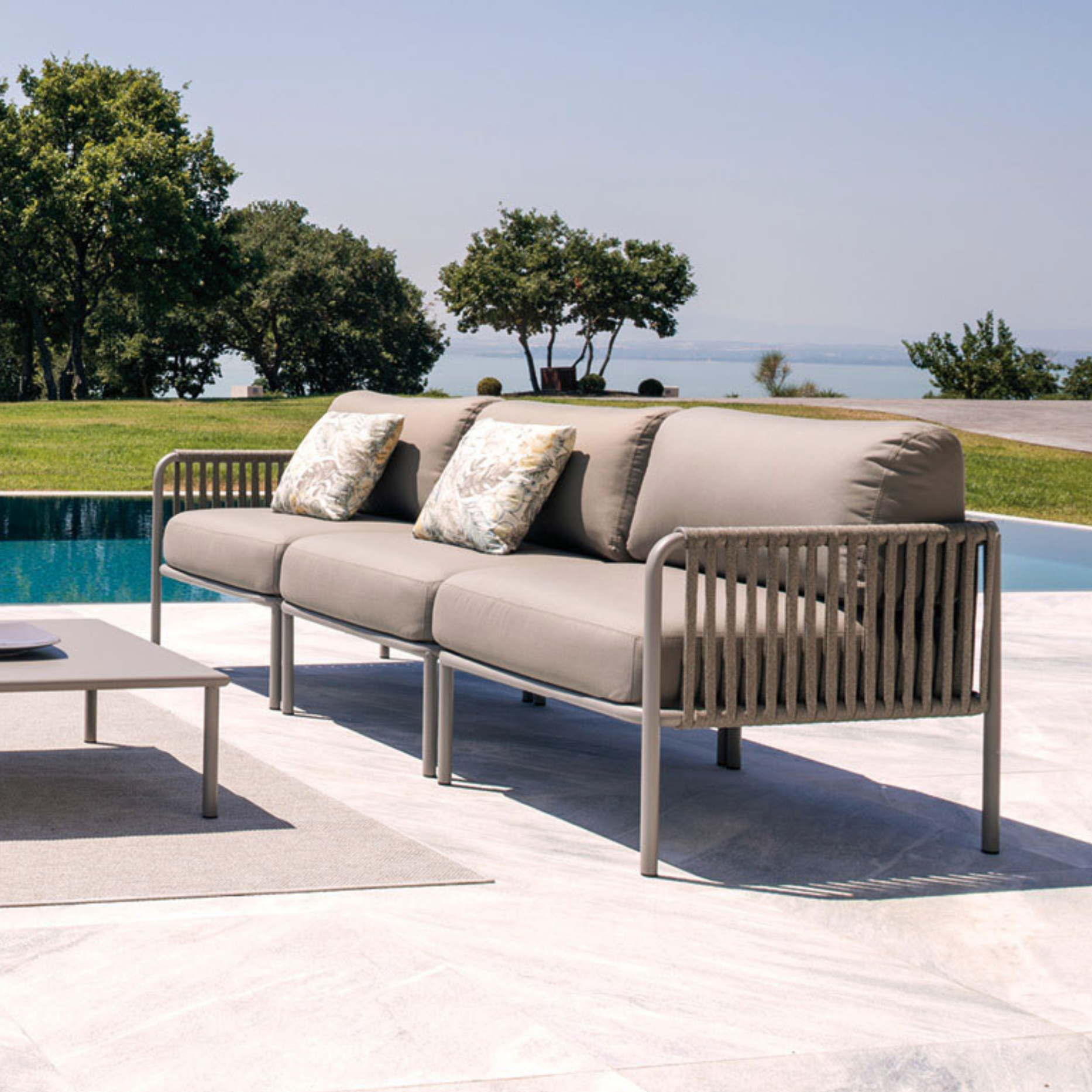
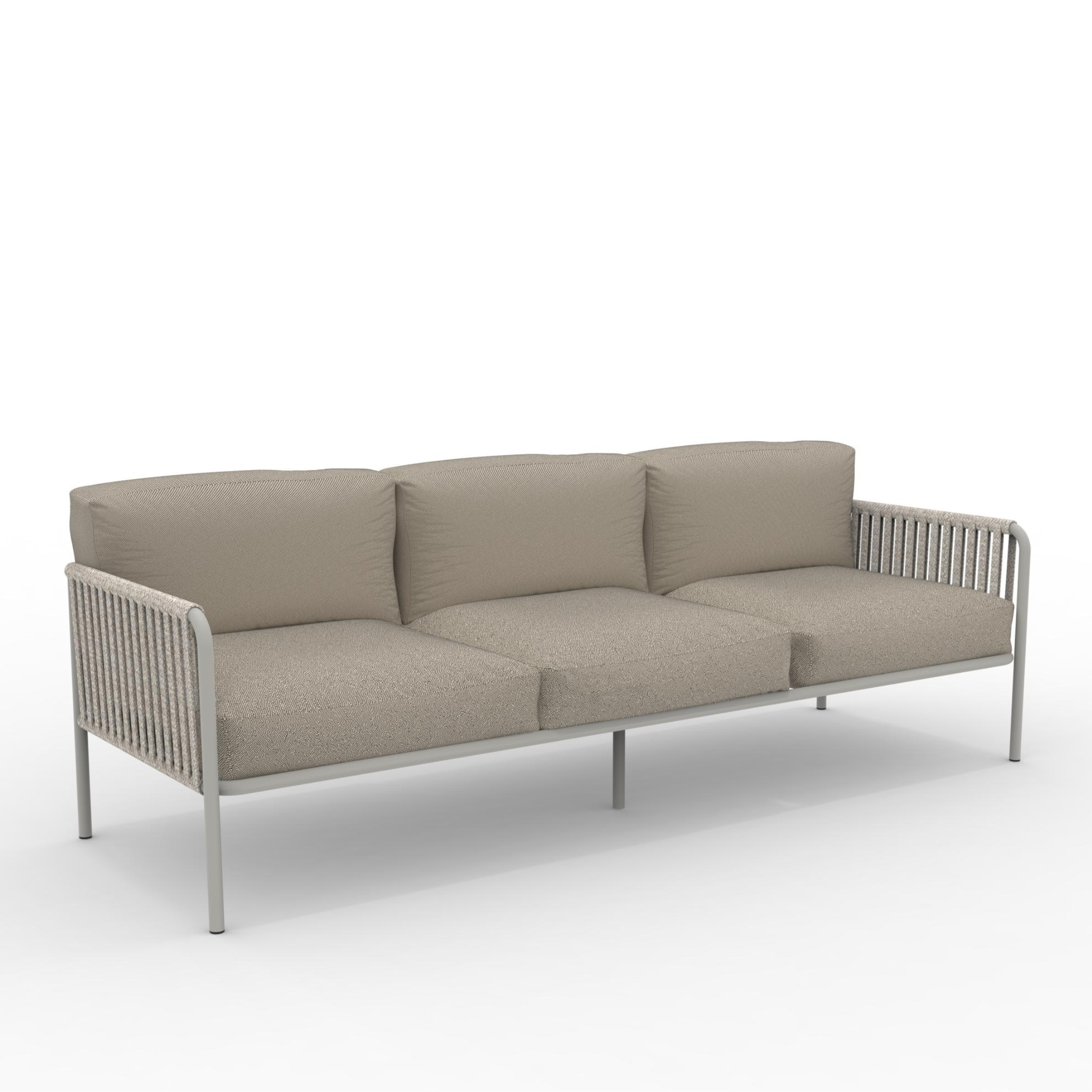
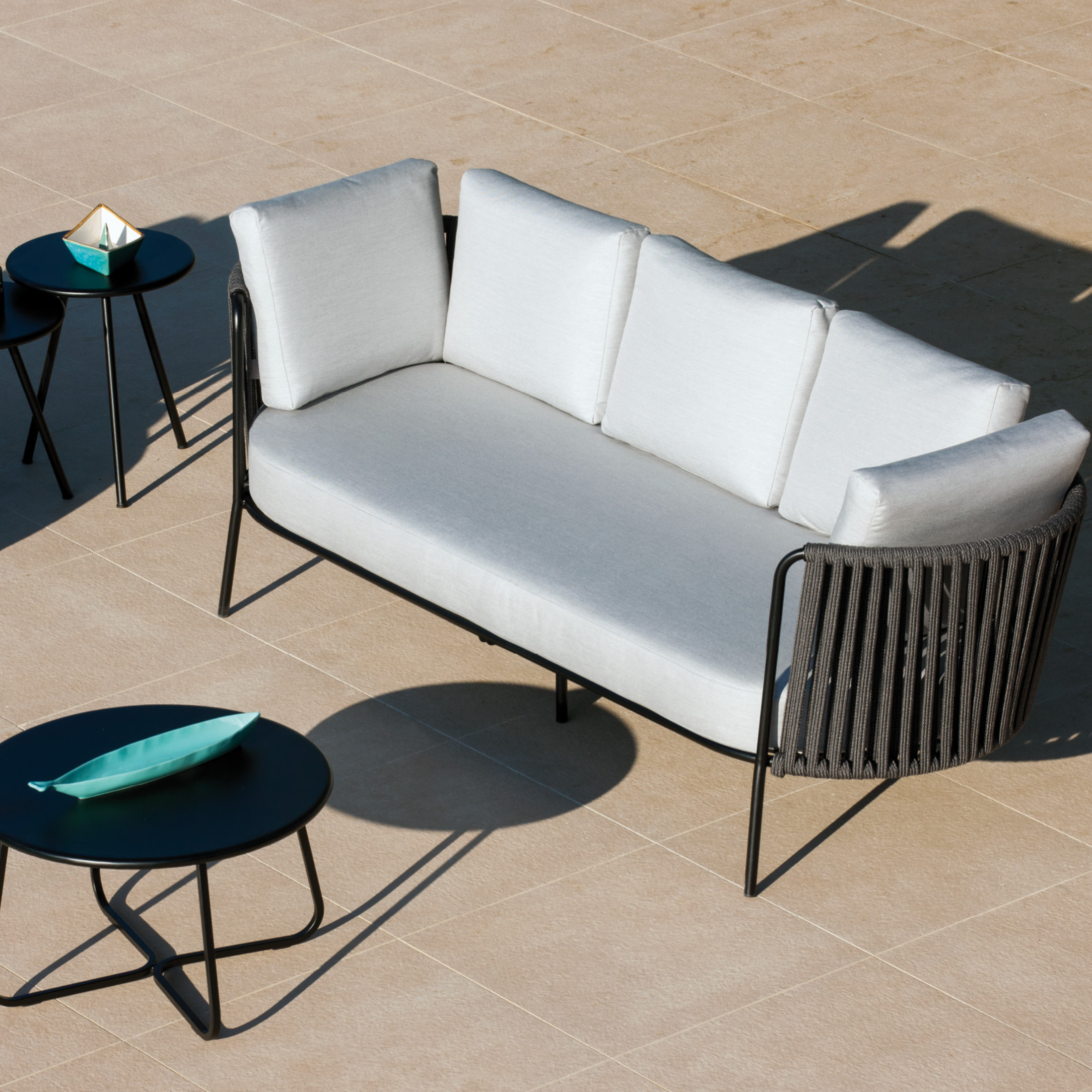
A good match isn't just about color, but also texture. Combine neutral tones with bolder details to add dynamism to a room. For example, a gray sofa can be accented with mustard-colored pillows or a patterned rug. Furthermore, integrating different materials like wood, metal, and soft fabrics creates an interesting and welcoming visual mix, especially when decorating a small home .
Enhance your home with the colors of Mondoviro!
With these tips, matching colors in your home will become a fun and creative activity, allowing you to personalize every room with style and harmony.
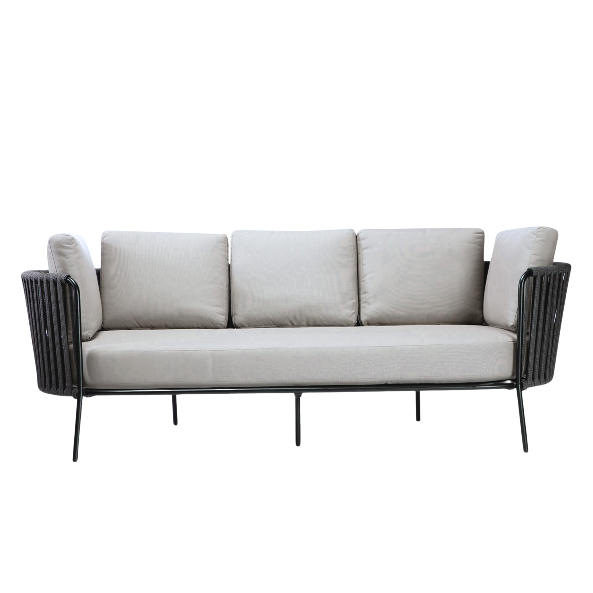
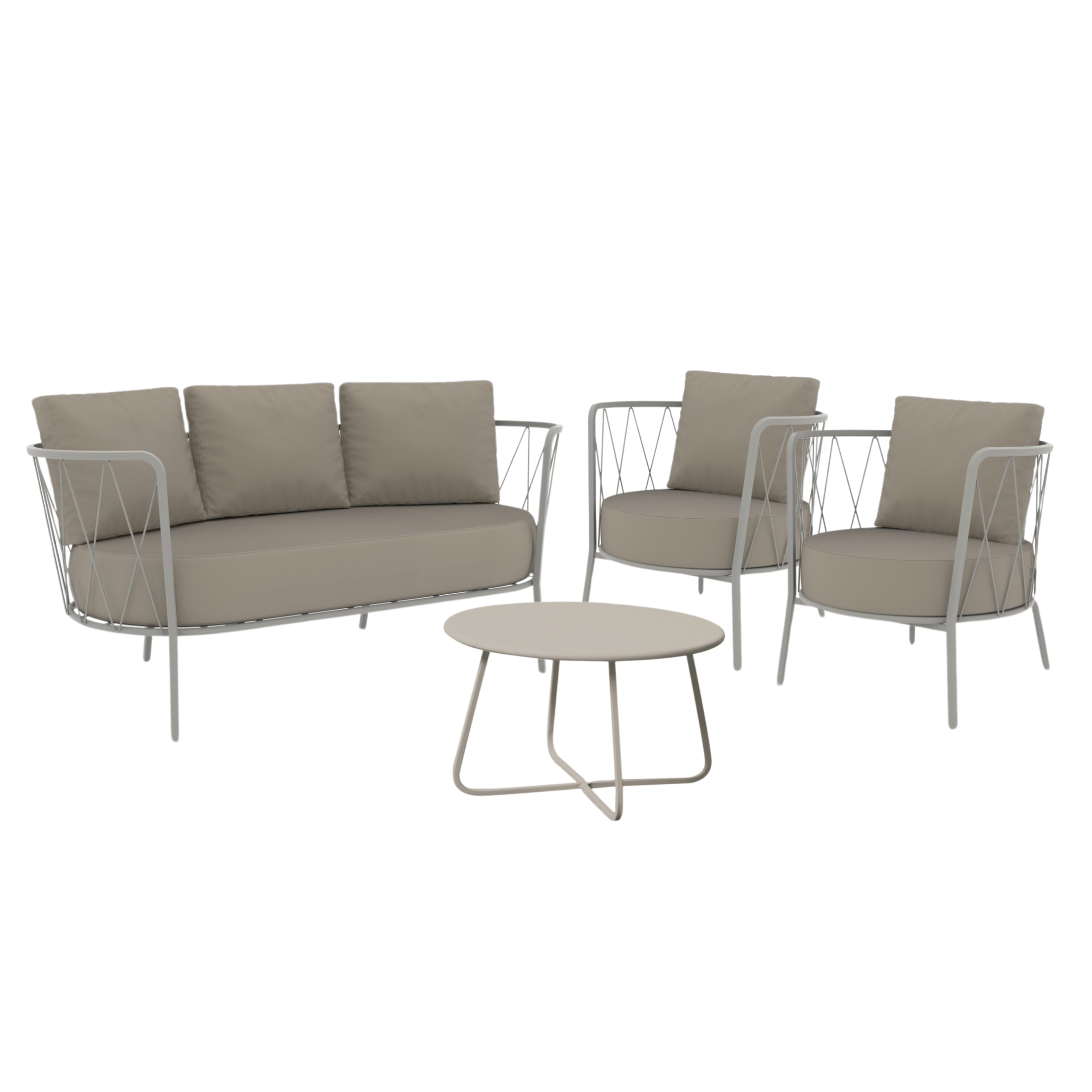
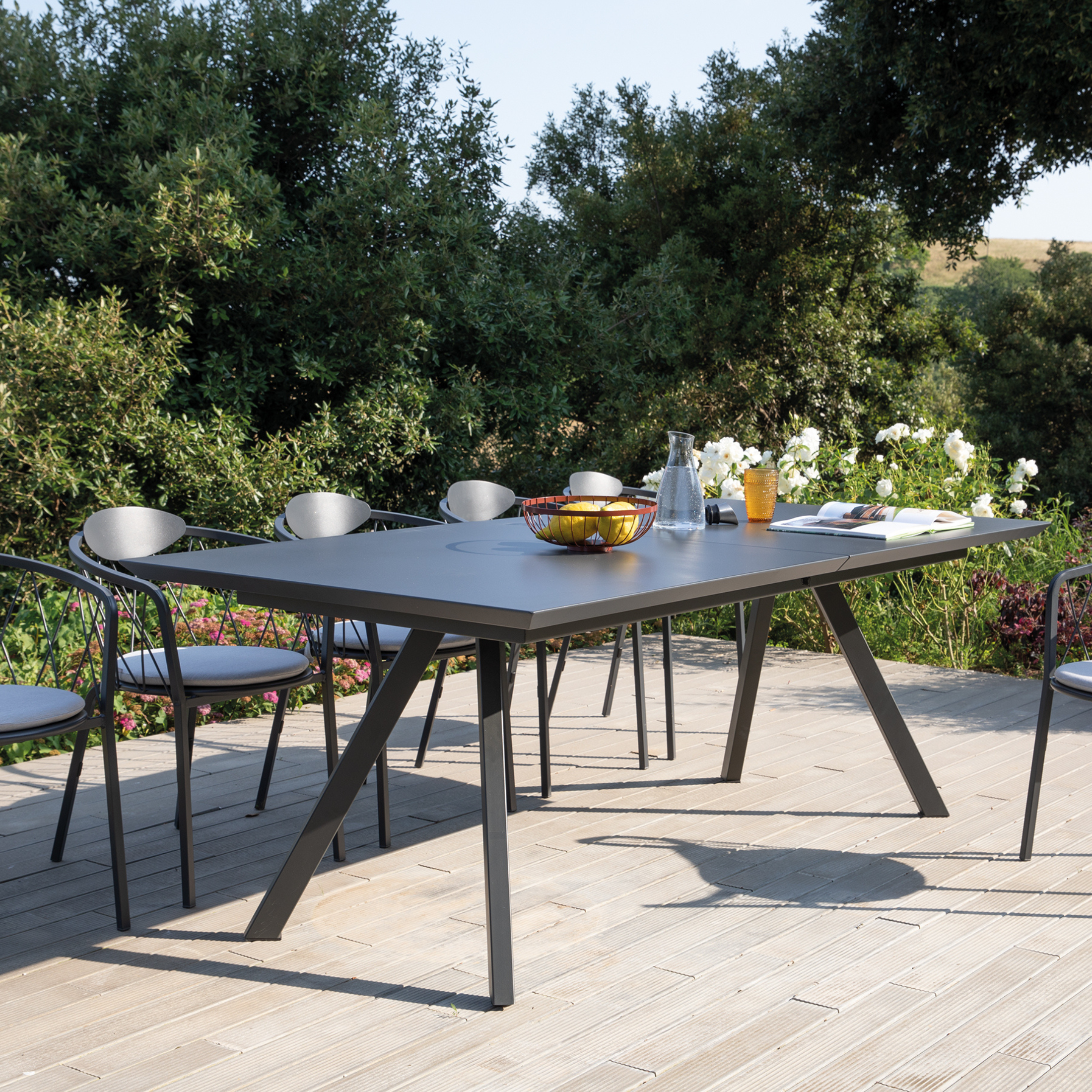
You can purchase the furniture and accessories you prefer on the Mondoviro online shop , such as modern chairs and armchairs in different colors , ideal for creating harmony and giving a touch of originality to the rooms.
Take advantage of our fast and safe shipping !


